Onchain: Hodler Cohorts
This article covers how Bitcoin onchain data can be used to monitor the behavior of various investor cohorts and how this information can serve as a powerful tool to diagnose the markets. Specifically, the HODL Wave chart is used to track the behavior of smarter investors.

This blog is part of an ongoing mini-series about onchain analysis.
There is a fascinating story to be told of the Bitcoin HODLERs cohorts. By closely monitoring these cohorts, astute long-term investors can unlock valuable signals that offer actionable insights.
What are Hodler cohorts?
Hodler cohorts are coins grouped by their age. Remember, new coins are created in every transactions, and a new coin has its lifespan reset to zero days and matures thereafter.
Depending on how fine-grained you want your analysis to be, you can define different age groups. The Bitcoin Researcher's Online Suite (RBN) provides different levels of granularity. For most purposes the coarser will suffice - and be best.
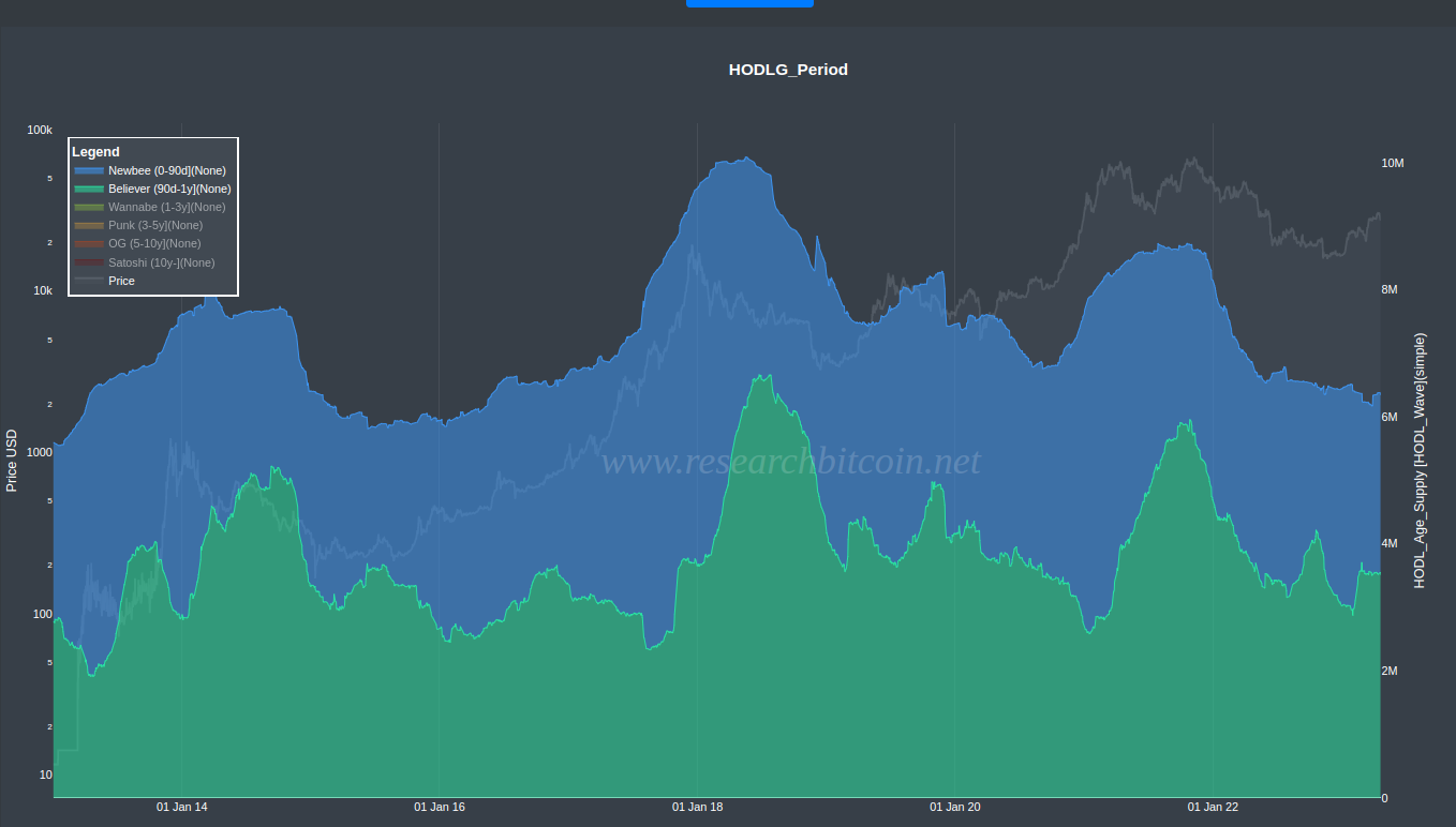
Below is a chart showing the hodler cohorts grouped by age, popularly called the HODL Wave chart.. Note that instead of showing the the actual amount of Bitcoin held by each cohort, we show the percent of the total supply available at each time point.
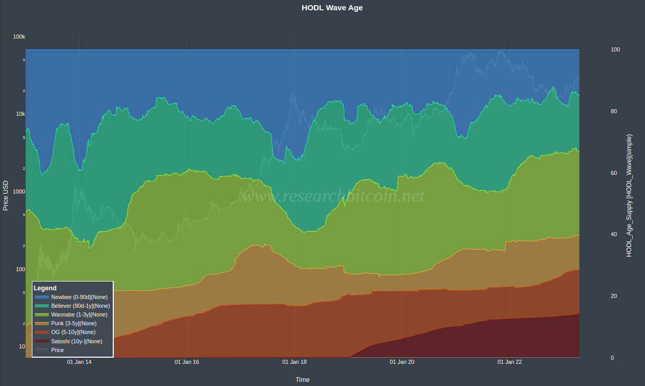
While showing all cohorts on the same chart is visually pleasing, it is not intuitively easy to comprehend. It will make more sense if you look at each cohort at a time.
The three most interesting cohorts are HODLERs aged 0-90 day [NewBee], 90d-1y [Believer], 1-3y [Wannabe].
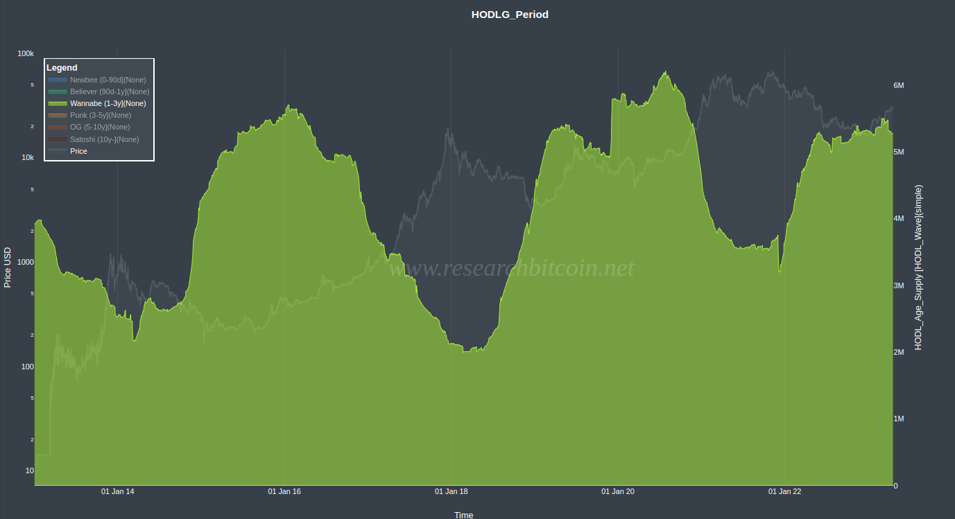
The HODL 1-3 year [Wannabe] cohort is dominated by seasoned investors. As you can see from the chart below, this cohort loaded their bags during the bottom 2015-16 and 2019-20 bear market. And systematically sold Bitcoin towards peak in Dec 2017 and April 2021. As a group, the HODL 1-3 years makes fairly timed and good decisions.
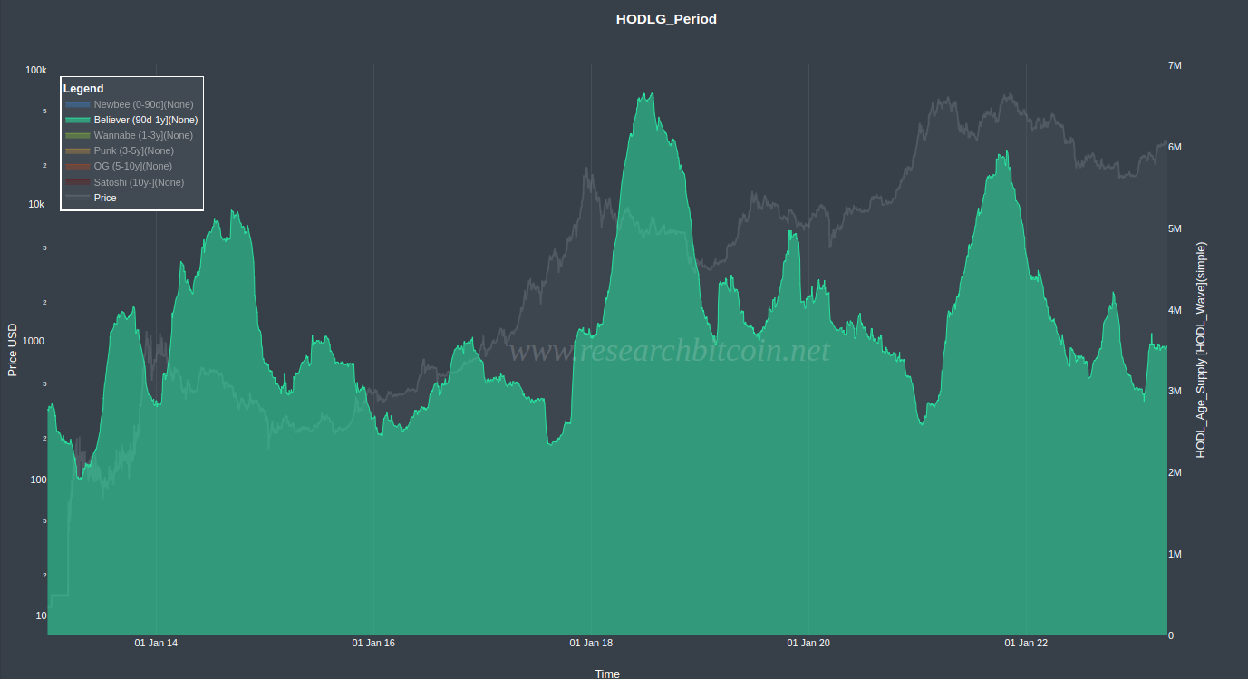
On the other hand, the HODL 90d-1Y cohort does most things wrong. This group stocked up poorly before the bull market commenced in 2016 and 2019/2020. Instead the kept buying in at increasing prices and sold their stack well past the price peaks of 2017 and 2021.
What about the Newbee cohort (0-90d)? This cohort represents the most liquid bitcoins in the market. In fact, over half of these coins are less than 30 days old and have a high probability of being spent again soon. As such, the NewBee cohort reflects the immediate sentiment of the market.
In bear markets, when apathy surrounds Bitcoin, the Newbee cohort (0-90 days) contracts. Conversely, during times of euphoria, as the price of Bitcoin appreciates and approaches its peaks, this cohort expands. This expansion is more mature HODL cohorts selling into the Newbee cohort.
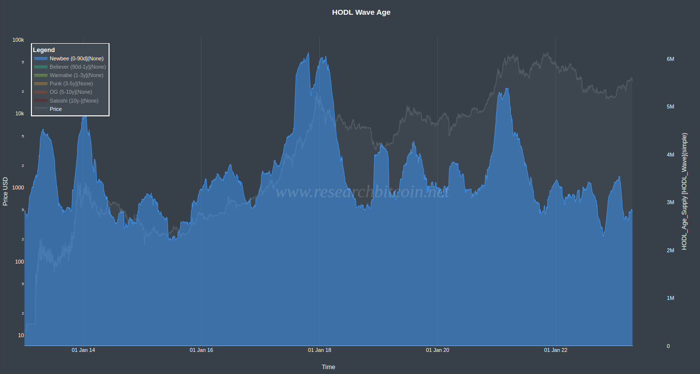
However, why did the November 2021 peak (the second peak) not coincide with a significant increase in the NewBee 0-90 day cohort?
The caveat when not showing all groups is that you miss the maturing into older HODL cohorts. Below is a HODL Wave chart with the exact same NewBee cohort (blue) but, in addition, the Believers (90d-1y) group (green). As you can see, during the November 2021 price peak, there was a significant increase in the Believer group, indicating an influx of new hodlers. This influx can only come from the NewBee cohort, as it is the only group with a shorter holding period (aging is one-way street 😊).
While looking at isolated cohorts can be useful, it must always be kept in mind that there is a continuous flow of hodlers gradually maturing. Studying this maturation is level 2 HODL chart analysis, more on that in a later blog.
In conclusion,
The HODL Wave charts of the 90d-1y and 1-3y mirrors the behavior of the not-so-smart and smart investor, respectively. The 0-90d cohort can be used to gauge the market sentiment.
You can find the HODL Wave Age Charts on The Bitcoin Researcher's Onchain Analysis Suite (RBN) - link is on the front page of this website. It is free and open for all.